good samaritan shelter
Centralizing resources for vulnerable individuals in Santa Barbara
PRODUCT DESIGN
NON-PROFIT
DESIGN SYSTEM
2025

Role
Design Manager
Team
Product Manager
7 Product Designers
Tools
Figma
FigJam
Notion
Slack
Skills
Wireframing
Prototyping
Usability Testing
Design System
Timeline
May - August 2025
OVERVIEW
Good Samaritan Shelter (GSS) is a nonprofit organization with a mission to provide emergency, transitional, and affordable housing with supportive services for the homeless and those in recovery throughout the Central Coast.
Problem
GSS has had issues with lack of awareness, pushing out crucial information, and scattered organization of their 70+ programs
Solution
An app that serves as a resource hub for individuals to find the resources they need, right at their fingertips
THE FOUNDATION
My role as Design Manager entailed UX strategy, systems thinking, product management, and client relations.
As a part of the role, I had the opportunity to develop a design system to maintain consistency across the designs of a team of 7 designers.
Google's Material Design guidelines laid the groundwork

Since this project's end users primarily use government issued Android cell phones, our team leaned on Material Design to establish a design system and specifications that would be accessible friendly:
Typefaces and Color
Components (Buttons, Cards, Lists, etc.)
Accessibility and Offline Specifications
Catering to visual and cognitive disabilities
The main colors and typefaces utilized in the app were provided by GSS as they have established branding to adhere to. The team chose to use a WCAG 2.2 friendly typeface, Lexend, for the app's content.
Lexend is a typeface specifically designed to help individuals read easier, including those with dyslexia or early reading problems. It also helps those who are simply tired or ill read easier and better as well (Google Design).

The color system was a key factor to consider. Alongside the branding colors provided by Good Samaritan, we adapted additional colors that would provide clear messaging within the app. One challenge was utilizing the given branding colors within the constraints of accessibility.

COMPONENT ARCHITECTURE
Building a design system from the ground up gave me the opportunity to explore different frameworks. I decided to deep dive into Brad Frost, the creator of the Atomic Design methodology.
Taking inspiration from chemistry, Frost established stages that would help create interface design systems in a more deliberate and hierarchical manner.

Based off of the team's mid-fidelity designs, I created "atoms" that would act as the base for all complex components for the high-fidelity prototype.

Maintaining accessibility from the start

Following Material Design's guidelines for structure and accessibility, the team ensured that all touch targets were at least 48 x 48dp, even if the button or icon is smaller.
According to W3C (World Wide Web Consortium) guidelines, enabled buttons need a 3:1 contrast ratio with the background.

Next: Molecules
With the atoms in place, they could be put together to create molecules.

Clear Call-to-Actions

For components requiring call to actions, we ensured that an icon always accompanied text and vice-versa. In addition to accessible spacing, this made sure that meaning came through in multiple ways.
Finally, Organisms
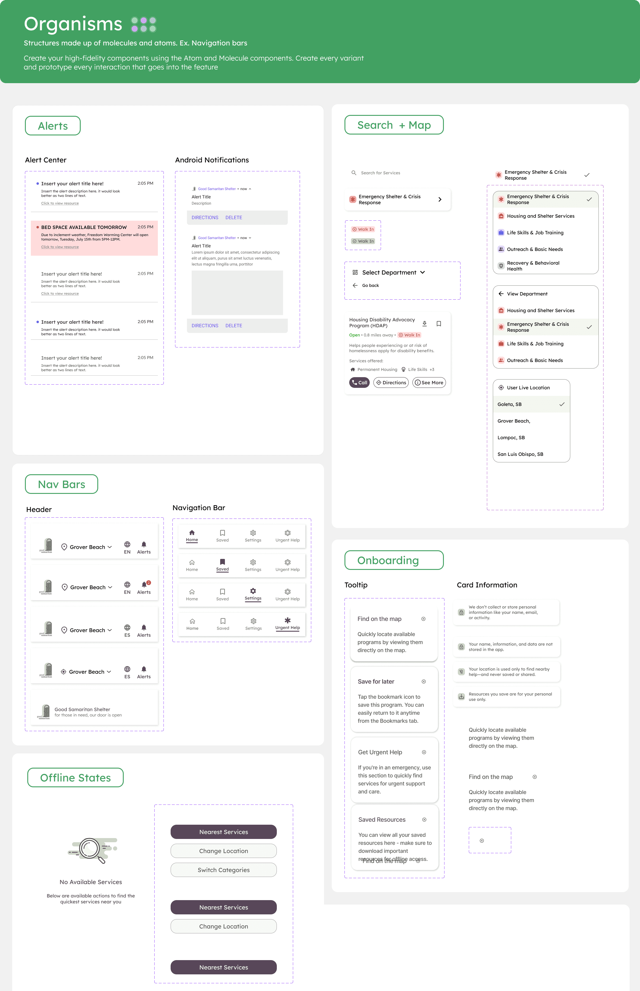
With atoms and molecules created, organisms were able to take shape according to the app's specific needs. Before adding a new organism, the component was vetted to ensure that it utilized the rest of the design system effectively.

Before

Unclear call to actions and visual hierarchy
Difficult to read text and icons
Varying card size due to too much text

After
Primary and secondary buttons used for different levels of importance
3:1 color contrast text
Cut off text to maintain card size
Consistency, consistency, consistency!
Maintaining local styles and variables was key to ensuring consistency across the entire design system. Adhering to these limited styles was key in preventing the creation of ad-hoc styles and the system falling apart.


DOCUMENTATION
I guided the team in design documentation, establishing a framework to describe specifications for each key feature. This included utilizing the Annotations feature in Figma to write detailed notes on accessibility, content, and interactions, and a comprehensive handoff document consisting of screen recordings and explanations of functionality.


FINAL PROTOTYPE
The team produced 6 fleshed out features: Service Finder, Alert Center, Offline Mode, Urgent Help, Onboarding tutorial, and a Saved section.
Check out how we went about designing these features and the final screens:
POSITIVE FEEDBACK

Good Samaritan Shelter Board Member
" We tasked the DFG team with creating something that - as far as we could tell - didn't exist anywhere. Good Samaritan Shelters is the largest provider of a range of services to the homeless community in Santa Barbara County. In fact, we provide so many services that no one outside of Good Samaritan had any idea how much we did or how to access everything we provide. So the App was our executive director's idea for how to unite all the resources for the entire county's homeless community in one, mobile place. Because the DFG team was asked to break new ground, this was a challenging task. But with the DFG blueprints in place, I feel confident that our eventual App builder will quickly be able to turn our vision into a working reality that will improve the lives of the vulnerable people Good Samaritan serves."

Jaya Sekhon
Develop for Good Project Lead
" … just wanted to say a huge well done for this batch. All your hard work & you taking on extra responsibilities on top of your DM (Design Manager) role was really impressive. I think a lot of the success of the project is thanks to your fab leadership. Excited to see what you do next!"
THE AMAZING, TALENTED TEAM
This incredibly impactful project couldn't have reached the level quality it did without the hard work and talent of the team of designers I had the absolute pleasure of guiding. Ranging from college freshmen to new graduates and masters students across 3 timezones, it took constant communication to keep everything on track.

From left to right, top to bottom: Ami Zhang, Liyuan Sun, Anna Zhang, Sana Antoun, Alexis Medina, Milly Zheng, Priya Venkatesan
good samaritan shelter
Centralizing resources for vulnerable individuals in Santa Barbara
PRODUCT DESIGN
NON-PROFIT
DESIGN SYSTEM
2025
Role
Design Manager
Team
Product Manager
7 Product Designers
Tools
Figma
FigJam
Notion
Slack
Skills
Wireframing
Prototyping
Usability Testing
Design System
Timeline
May - August 2025
OVERVIEW
Good Samaritan Shelter (GSS) is a nonprofit organization with a mission to provide emergency, transitional, and affordable housing with supportive services for the homeless and those in recovery throughout the Central Coast.
Problem
GSS has had issues with lack of awareness, pushing out crucial information, and scattered organization of their 70+ programs
Solution
An app that serves as a resource hub for individuals to find the resources they need, right at their fingertips
THE FOUNDATION
My role as Design Manager entailed UX strategy, systems thinking, product management, and client relations.
As a part of the role, I had the opportunity to develop a design system to maintain consistency across the designs of a team of 7 designers.
Google's Material Design guidelines laid the groundwork
Since this project's end users primarily use government issued Android cell phones, our team leaned on Material Design to establish a design system and specifications that would be accessible friendly:
Typefaces and Color
Components (Buttons, Cards, Lists, etc.)
Accessibility and Offline Specifications
Catering to visual and cognitive disabilities
The main colors and typefaces utilized in the app were provided by GSS as they have established branding to adhere to. The team chose to use a WCAG 2.2 friendly typeface, Lexend, for the app's content.
Lexend is a typeface specifically designed to help individuals read easier, including those with dyslexia or early reading problems. It also helps those who are simply tired or ill read easier and better as well (Google Design).
The color system was a key factor to consider. Alongside the branding colors provided by Good Samaritan, we adapted additional colors that would provide clear messaging within the app. One challenge was utilizing the given branding colors within the constraints of accessibility.
COMPONENT ARCHITECTURE
Building a design system from the ground up gave me the opportunity to explore different frameworks. I decided to deep dive into Brad Frost, the creator of the Atomic Design methodology.
Taking inspiration from chemistry, Frost established stages that would help create interface design systems in a more deliberate and hierarchical manner.
Based off of the team's mid-fidelity designs, I created "atoms" that would act as the base for all complex components for the high-fidelity prototype.
Maintaining accessibility from the start
Following Material Design's guidelines for structure and accessibility, the team ensured that all touch targets were at least 48 x 48dp, even if the button or icon is smaller.
According to W3C (World Wide Web Consortium) guidelines, enabled buttons need a 3:1 contrast ratio with the background.
Next: Molecules
With the atoms in place, they could be put together to create molecules.
Clear Call-to-Actions
For components requiring call to actions, we ensured that an icon always accompanied text and vice-versa. In addition to accessible spacing, this made sure that meaning came through in multiple ways.
Finally, Organisms
With atoms and molecules created, organisms were able to take shape according to the app's specific needs. Before adding a new organism, the component was vetted to ensure that it utilized the rest of the design system effectively.
Before
Unclear call to actions and visual hierarchy
Difficult to read text and icons
Varying card size due to too much text
After
Primary and secondary buttons used for different levels of importance
3:1 color contrast text
Cut off text to maintain card size
Consistency, consistency, consistency!
Maintaining local styles and variables was key to ensuring consistency across the entire design system. Adhering to these limited styles was key in preventing the creation of ad-hoc styles and the system falling apart.
DOCUMENTATION
I guided the team in design documentation, establishing a framework to describe specifications for each key feature. This included utilizing the Annotations feature in Figma to write detailed notes on accessibility, content, and interactions, and a comprehensive handoff document consisting of screen recordings and explanations of functionality.
FINAL PROTOTYPE
The team produced 6 fleshed out features: Service Finder, Alert Center, Offline Mode, Urgent Help, Onboarding tutorial, and a Saved section.
Check out how we went about designing these features and the final screens:
POSITIVE FEEDBACK
Good Samaritan Shelter Board Member
" We tasked the DFG team with creating something that - as far as we could tell - didn't exist anywhere. Good Samaritan Shelters is the largest provider of a range of services to the homeless community in Santa Barbara County. In fact, we provide so many services that no one outside of Good Samaritan had any idea how much we did or how to access everything we provide. So the App was our executive director's idea for how to unite all the resources for the entire county's homeless community in one, mobile place. Because the DFG team was asked to break new ground, this was a challenging task. But with the DFG blueprints in place, I feel confident that our eventual App builder will quickly be able to turn our vision into a working reality that will improve the lives of the vulnerable people Good Samaritan serves."
Jaya Sekhon
Develop for Good Project Lead
" … just wanted to say a huge well done for this batch. All your hard work & you taking on extra responsibilities on top of your DM (Design Manager) role was really impressive. I think a lot of the success of the project is thanks to your fab leadership. Excited to see what you do next!"
THE AMAZING, TALENTED TEAM
This incredibly impactful project couldn't have reached the level quality it did without the hard work and talent of the team of designers I had the absolute pleasure of guiding. Ranging from college freshmen to new graduates and masters students across 3 timezones, it took constant communication to keep everything on track.
From left to right, top to bottom: Ami Zhang, Liyuan Sun, Anna Zhang, Sana Antoun, Alexis Medina, Milly Zheng, Priya Venkatesan