OVERVIEW
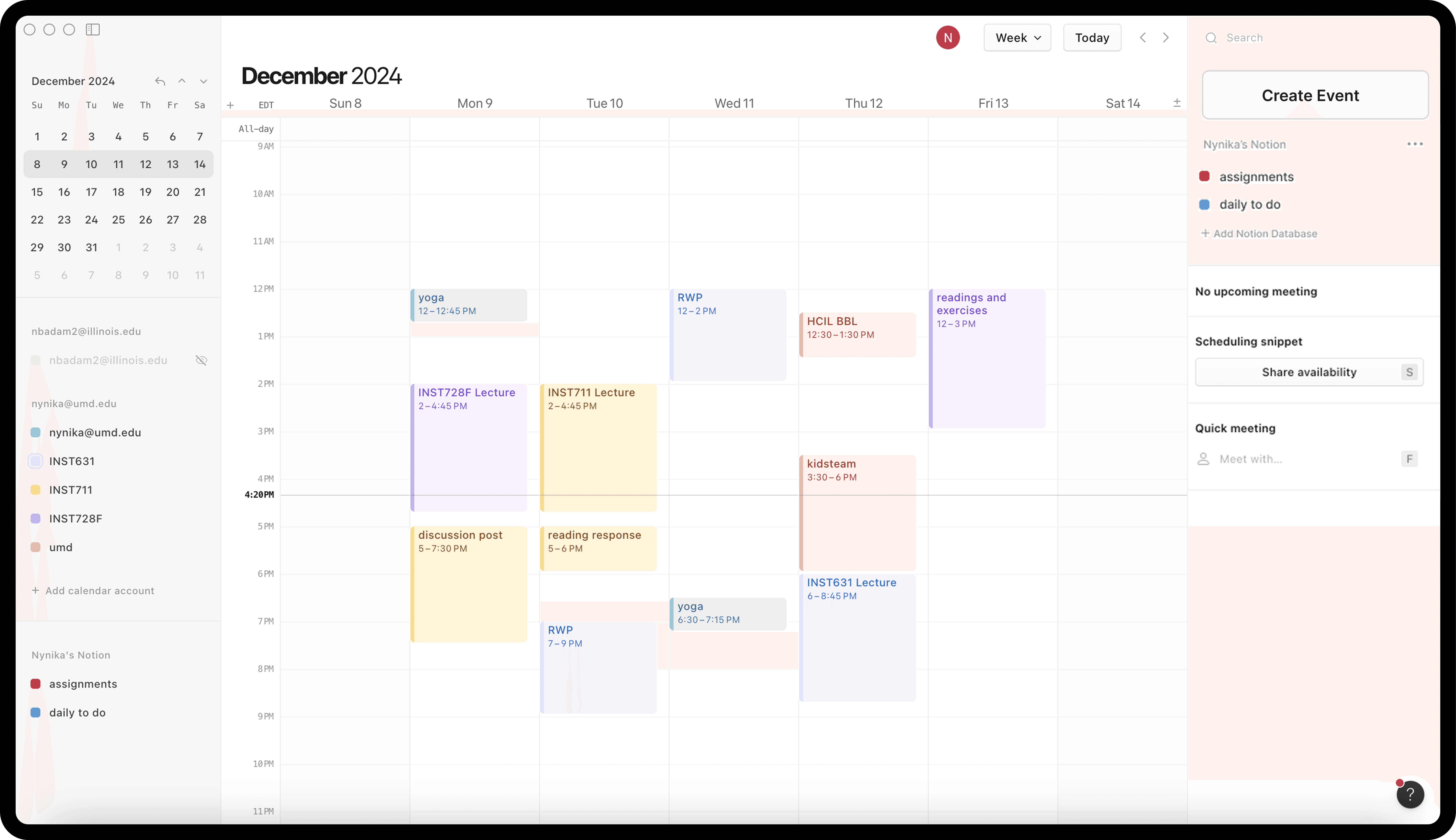
Notion Calendar is an application that allows you to view your Notion database items alongside your Google Calendar events, effectively combining the two applications. This case study utilizes usability testing to gauge feature functionality and intuitiveness within Notion Calendar. It also explores the integration with Google Calendar and how successful those features are.
Problem
Notion Calendar has many glaring issues including discoverability and readability, choosing to place aesthetics above usability.
Solution
Redesign application UI to address user pain points by integrating WCAG 2.0 while maintaining Notion branding and aesthetic
or more specifically,
How might we…
make Notion Calendar more intuitive and accessible for new Notion users?
RESEARCH
To pinpoint where exactly Notion Calendar falls short in its user experience, I conducted a series of usability tests and user interviews with non-Notion Calendar users. I interviewed 6 people:
18-25
Age
4
Use a calendar app regularly
2
Don't use a calendar app at all
Usability Testing
I defined 3 tasks for interviewees to perform during their usability test, all of which cover basic actions and main features promoted by Notion that the application should achieve. Each task has a scenario to provide context in which the interviewee has to complete the task, some of which required interacting with Notion pages. For convenience, my personal Notion Calendar and Notion were used for testing. The tasks and their criteria for success are as follows:
Create an event
Event is visible in calendar
All details marked in event (name, recurring, day, etc.)
Connect an existing Notion database
Database is viewable in side bar
Events from database populate calendar
Schedule a meeting
Meeting is visible in calendar
All details marked in event (name, recurring, day, etc.)
Interviewees struggled to successfully complete tasks in a timely manner
For each of the 6 usability tests, I tracked whether each task was successfully completed according to the criteria above, time taken, and outstanding notes. Participants were asked to speak out loud as they conducted these tasks. The time taken for each task is an approximation (includes the time to read the task, perform the tasks, and questions in between).
It took up to 1 minute for participants to discover where these features were in the interface.

User Interviews
At the end of each round of usability testing, I asked each interviewee a series of semi-structured, open-ended and closed questions reflecting on the 3 tasks as well as general thoughts on the application.

The resulting affinity diagram from interviewee responses allowed me to determine specific pain points, among other themes.
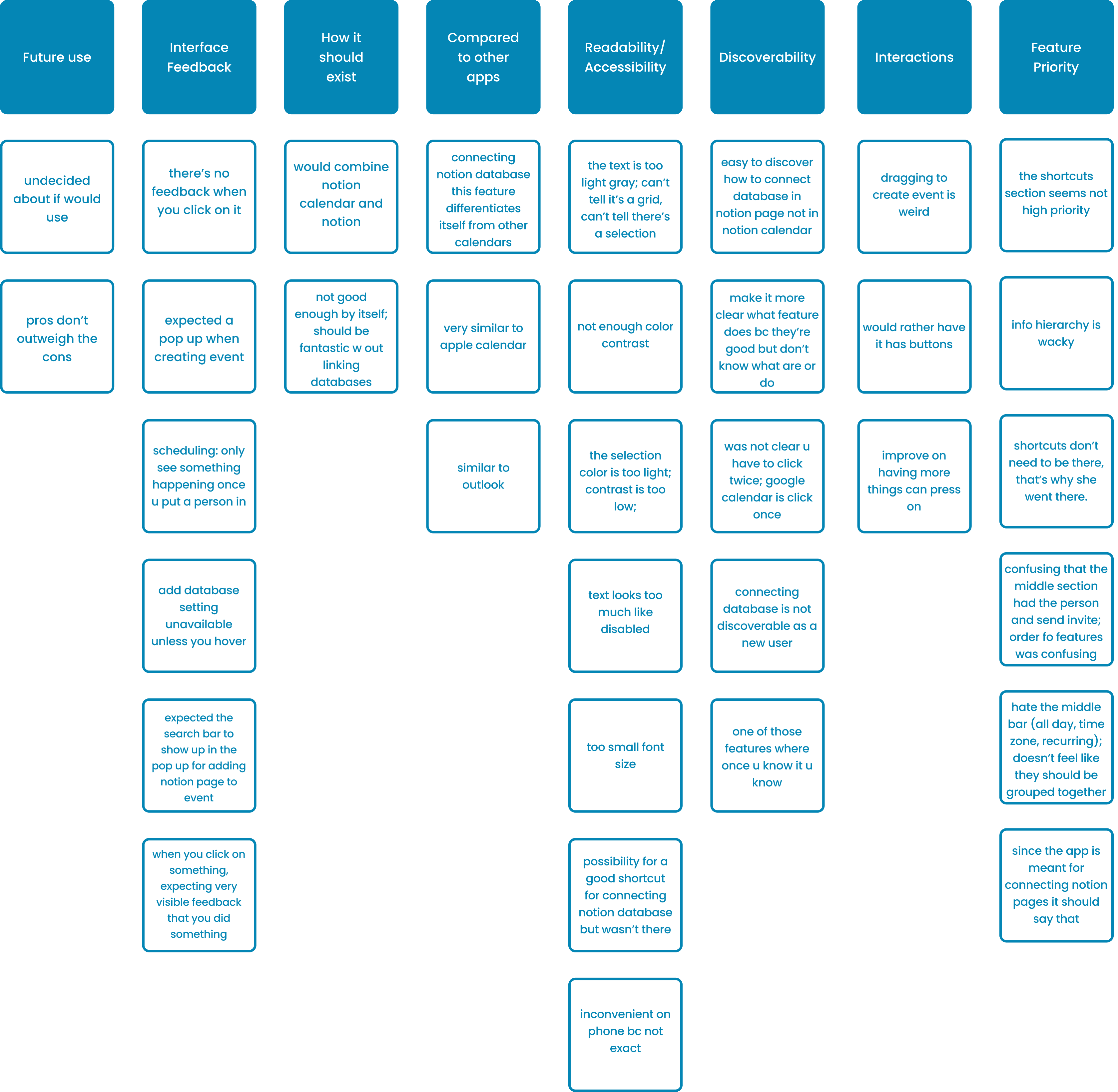
With insights from these usability tests and user interviews, I was able to determine 3 key pain points:
1
Discoverability
It's difficult to discover how to do basic tasks like create an event or link a database
2
Organization
Organization of components on sidebars and scheduling felt unintuitive to follow
3
Readability
Users struggled to read text, see gridlines, and differentiate between active and disabled text
DESIGN
My approach on how to tackle each key pain point was to stay true to the Notion Calendar interface by just introducing components or moving components around in the interface rather than redoing the whole application. This problem lends itself to subtle solutions that will make a dramatic impact.
Solution 1: Discovering Basic Tasks
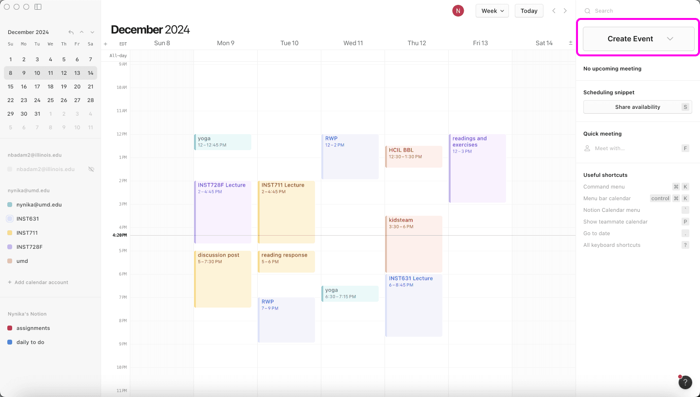
Before: There is no discernible call to action prompting a user to create an event
There is no button to create events anywhere on the opening screen. The seemingly only way to create events is by manually clicking and dragging on the grid. There are no instructions that indicate to do this.

After: A "Create Event" button provides a clear call to action for the user
This would be the first place a user would go to start populating their calendar. This way, there are multiple ways for a user to complete the same action. This addresses external consistency and standards.

Before: It is difficult to discover where to go to connect an existing Notion Database
The major pain point is that there is no clear indication that a user can click on anything. It is not clear that this organizes databases from Nynika’s Notion or that in order to connect an existing database, a user needs to hover and then click on the three dots.

After: A visible button provides a clear call to action for the user
The improved feature provides for an explicit button to add a new Notion database, "Add Notion Database", while keeping the original design. Making the three dots visible at all times allows for the user to discover it more easily.

Solution 2: Sidebars Organization
Before: It was frustrating to search for basic features that users needed in the sidebars
Based on the user tests, the arrangement of where the shortcuts and connecting Notion Database feature should be readjusted so that there is a higher priority on the latter. (I've included previously discussed solutions in this solution as well)
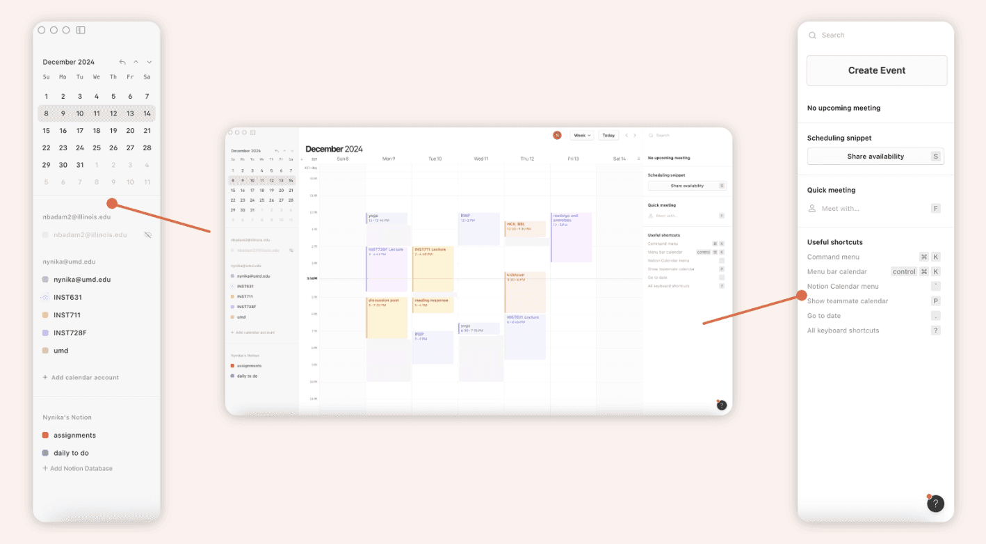
After: High priority features grouped together
The new and improved version of the add Notion Database feature was moved to the right side bar and placed immediately under the new Create Event. This indicates that these features are high priority and what a user can look to first. As indicated by the user tests, the shortcuts were a low priority so they were moved to the bottom left.


Solution 3: Readability
In order to improve visibility of grid lines and readability of text, I explored how WCAG 2.0 could be implemented in the application to improve accessibility for everyone.

Further improving accessibility with assistive technology
I also explored how assistive technologies could widen the horizons of Notion Calendar and even Notion's user base to include people of all kinds of accessibility needs. The color palette employed by Notion Calendar does not offer enough contrast for users even with out visual impairments to comfortably use the application. By following WCAG at least at a Level AA conformance will allow for a broader range of users to successfully use the application.
Change Font
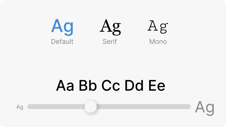
Adding the ability to change the size of the font within Notion Calendar would greatly benefit visually impaired individuals as well as able bodied individuals. A dynamic slider will change the sample text accordingly to allow for a user to visualize the text size.
Tools

Providing additional tools like screen readers and magnification allows the visually impaired to access all the information they need.
Voice Control

This feature especially aids those with mobility differences allowing them to navigate an interface with just their voice.
Keyboard Control: Customizable Shortcuts

Although Notion Calendar encourages keyboard shortcuts, they are set and don’t allow for customization. Allowing customization would allow users to use the interface how they see fit.
TESTING
Click Testing
In the context of the usability test tasks, my solutions largely improve upon discoverability and organization, therefore improving final execution of the tasks. As a result, in order to test if my changes improve user experience, I conducted a round of click testing with 3 new interviewees (no one from the original usability testing) in order to test new Notion users.
Interviewees performed drastically better in finding key features
~ 5 sec
~ 10 sec
~ 4 sec
Compared to the average time of 1 minute to discover where these features were in the usability testing, interviewees were able to find how to start each of the 3 original tasks exceedingly faster. With this quantitative data, I was able to validate the goal I set out to solve: make Notion Calendar more intuitive and accessible for new Notion users.
TAKEAWAYS
As an avid Notion lover, this was a super fun case study to do. As a budding Product Designer, this case study exposed me to the concept of implementing subtle solutions that will make a dramatic impact.
Next Steps
Exploring better onboarding onto Notion Calendar, with a quick tutorial pointing out notable features and how to conduct basic actions. This would help curb the steep learning curve of the application while maintaining the minimalist design.
UXR Learning
This was my first time conducting usability testing, where I realized the importance of doing a pilot test before jumping into tests with actual participants. I was also able to get more practice at synthesizing usability tests and user interview insights.
Some out of scope thoughts:
This case study was also a reality check. Even a company like Notion that has built a well known brand and aesthetic can be at risk of placing aesthetic above usability. However, while conducting this study, I started considering who is Notion Calendar meant for? Is it for the niche of people who use Notion Calendar and Google Calendar? Is there a certain novelty in making the application have a learning curve to fuel the Notion lover? I have a million more questions and as a result, hope to expand on this case study by exploring these answers.